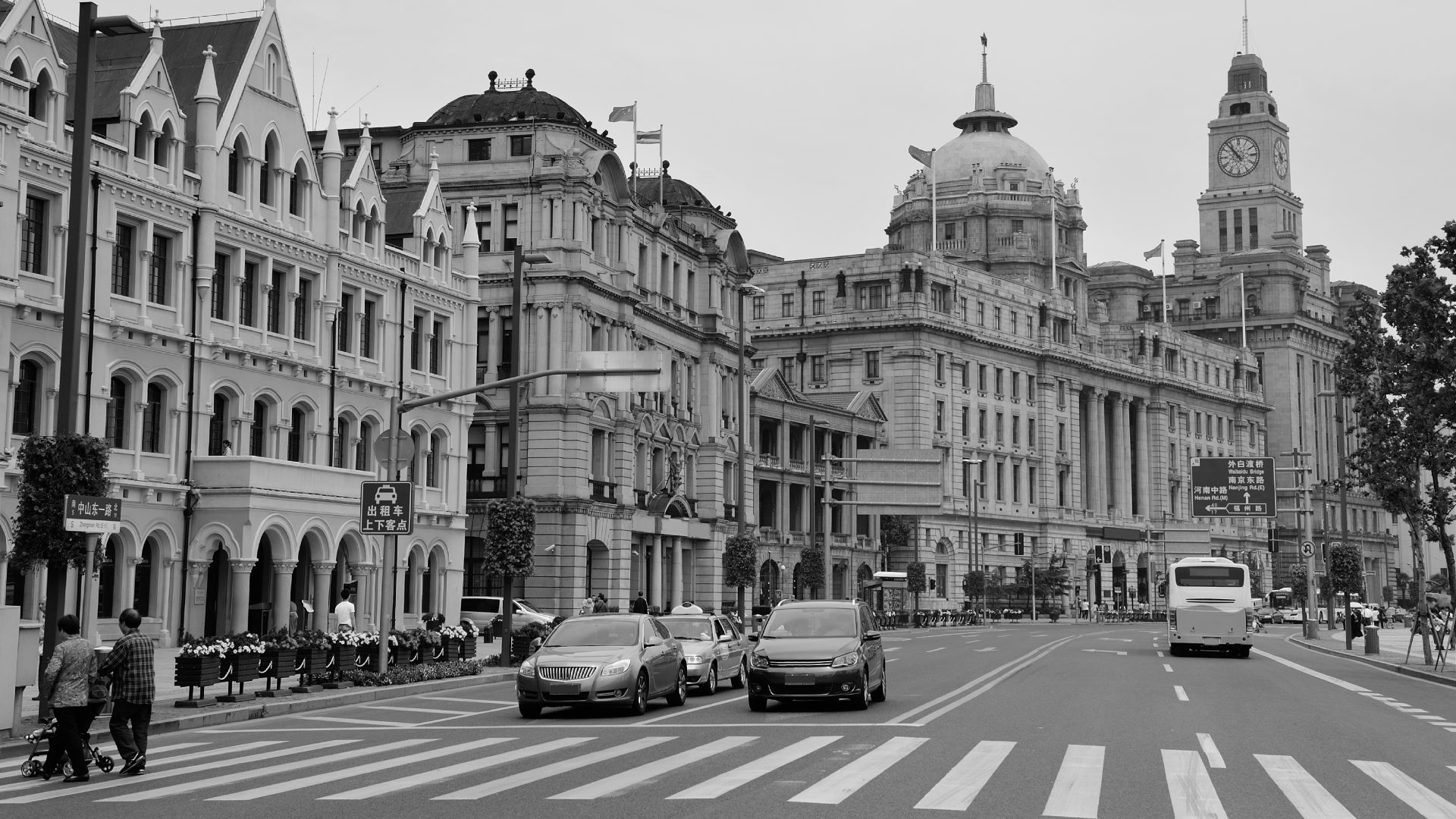
Looking around, a subtle impression takes hold: colors seem to fade. From streets to closets, from living rooms to screens, a single visual softness prevails. Behind this muted aesthetic lies a profound trend, revealing our relationship to the world and to ourselves.
The era of greige: when neutrality reigns supreme
For several years now, a very specific palette has been permeating all creative fields. Delicate grays, powdery beiges, off-whites, and sandy tones form what is now called the "age of greige," a blend of gray and beige. This minimalist aesthetic is making its way into fashion, architecture, interior design, and the visual identities of major brands. These colors have one thing in common: they are easy on the eyes. They envelop the body, soothe spaces, and create a reassuring sense of continuity.
An emotional response to a world under tension
The popularity of these colors is no accident. Many experts see it as a collective reaction to an era marked by uncertainty. After successive crises—health, climate, and social—the need for security is reflected even in our aesthetic choices.
Neutral tones offer a visual refuge. They calm the mind, reduce sensory overload, and provide a sense of stability. Choosing beige or light gray isn't about giving up self-expression, but sometimes about seeking to feel good, aligned, and grounded in a gentle environment that respects everyone's pace.
When aesthetic caution becomes the norm
However, this generalization of neutrality raises questions. By favoring so-called "safe" colors, are we not risking erasing visual diversity? Where color could once express joy, boldness, or emotion, it is sometimes perceived as "too engaging," "too assertive," almost "disturbing."
This "aesthetic caution" can lead to bland environments where everything looks the same. While greige promotes comfort and harmony, its omnipresence can also limit space for creativity and personal expression. Color, after all, has long been a language in its own right, capable of telling stories and celebrating differences.
Social networks: the neutrality loop
Visual platforms play a key role in this standardization. On Instagram and Pinterest, interiors with cream walls, monochrome looks, and minimalist staging largely dominate. The more these images circulate, the more desirable they become.
This phenomenon creates a validation loop: what is seen everywhere is perceived as elegant, modern, and desirable. More colorful, less common alternatives suddenly seem marginal. Thus, neutrality is imposed not only by taste, but also by collective mimicry.
Pantone 2026: Cloud Dancer, the almost non-color
Pantone's announcement for 2026 perfectly illustrates this dynamic. Cloud Dancer, an extremely pale off-white, has been designated the color of the year 2026. A shade so subtle it borders on absence, like a visual breath.
This choice symbolizes an era saturated with information and images, where calm has become a luxury. For some, this soft white is an invitation to breathe and serenity. For others, it embodies a form of excessive restraint, or even an abandonment of chromatic joy.
Disappearance of color or simply a visual pause?
To speak of a world entirely devoid of color would be an exaggeration. Fortunately, vibrant creative currents persist in fashion, art, and alternative cultures. The rise of greige and desaturated tones, however, reveals a shift in collective mood.
In short, our era seems to favor comfort, uniformity, and respect for bodies as they are, without blatant artifice. Perhaps color will return when the desire for individuality and joyful expression resurfaces.

